Dynamic Notch Notification Bar
- 4.7
- Rating
- 5.00M
- Installs
- Free
- Price
 Analysis by App-foxy
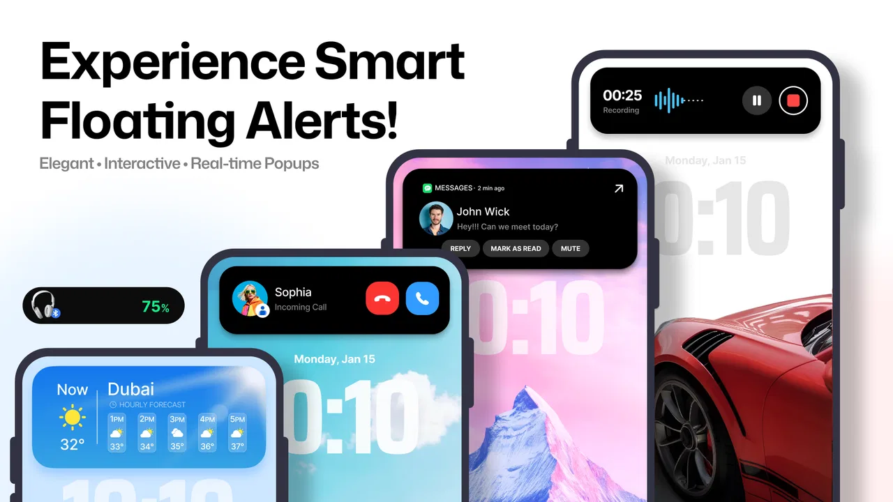
I tried Dynamic Notch Notification Bar as a small productivity utility rather than a full notification manager, and that distinction matters. Its purpose is to add a dynamic notch-style area to an Android phone, giving notifications and selected status information a more visible place on the screen. The idea is simple, but the usefulness depends heavily on whether you enjoy a more animated, iPhone-inspired interface or prefer Android’s quieter notification shade.
The app is free to install, and it is aimed at a general audience with an Everyone content rating. Mahashivratri App has positioned it as an easy visual customization tool, not as a replacement for the Android notification system. In my experience, that makes it most interesting for people who want notifications to feel more noticeable without changing their launcher, icon pack, or entire home-screen setup.
What I like immediately is that the concept is easy to understand. You do not need to learn a complicated productivity workflow. You enable the bar, adjust the available behavior to your liking, and then decide whether the extra visual layer helps you. The important question is not whether the effect looks attractive for a few minutes; it is whether it remains useful during normal phone use.
You May Also Like

 Blood Strike: 2.5 Anniversary
Blood Strike’s Loadouts Turn Every Drop Into a Tactical Gamble
A close look at Blood Strike’s custom loadouts: how fast access to signature weapons reshapes its battle royale rhythm, rewards preparation, and narrows the gap between fights.

 Pandora - Music & Podcasts
Pandora’s Music Is Easy to Start, but Harder to Recover
Pandora’s strength is its low-effort path from a seed to a station. Its weak spot is how much confidence it asks you to place in connection, setup, and quiet recovery.

 8 Ball Pool
 Is Built on Rivalries, Rematches, and Routine
A close look at the rivalries, rematches, shared routines, and unanswered safety questions that turn a quick pool match into a persistent mobile community.

 Samsung Music
’s Quiet Strength Is Playing What You Already Own
Its reach comes less from spectacle than from dependable access to a personal library. That simplicity is both the app’s strongest retention engine and its ceiling.

 AccuWeather: Weather Radar
AccuWeather Review: A Quick, Clear Forecast for Everyday Decisions
For everyday plans, the best forecast is the one you can understand quickly. AccuWeather makes rain timing, radar, and local conditions easy to act on, with a few trade-offs.

 Hill Climb Racing
Why Hill Climb Racing Still Turns Crashes Into One More Run
A tiny car, a bumpy hill and one more upgrade: Hill Climb Racing keeps resurfacing because its simple chaos makes every near-miss feel personal.
More From Our News Desk



How the current experience feels in everyday use
The dynamic bar works best as a glanceable layer. Instead of waiting until I pull down the notification shade, I can notice activity near the top of the display. That is convenient when I am cooking, walking between tasks, or checking the phone briefly during work. A visual cue can be faster than opening a full panel, especially when I only want to know whether something needs attention.
A realistic example is a busy afternoon with messages arriving while I am using another app. The bar gives those events a more immediate presence, so I can decide whether to respond now or leave them for later. It does not magically organize the notifications, though. If several apps are noisy, the added animation can make the phone feel busier rather than more organized. I found it most comfortable when paired with sensible notification settings elsewhere in Android.
That is the first practical tip I would give: reduce unnecessary alerts before relying on this tool. The bar is a spotlight, not a filter. If social apps, shopping apps, games, and email accounts all send frequent notifications, highlighting everything weakens the value of highlighting anything. Used with a trimmed notification setup, the feature feels intentional. Used with an overloaded one, it can become visual clutter.
The app belongs in the productivity section because it can shorten the path from seeing an alert to deciding what to do. Still, it is not a task manager, calendar, notes app, or inbox. It will not replace a system for planning work. Its productivity benefit is indirect: it can make certain phone events easier to notice while keeping the current app open.
What changed through the current version
The current version is 6.3, which suggests a more mature stage than an early experiment. I would not interpret that number as proof that every phone behaves identically, but it does indicate that the app has moved beyond a one-off visual demo. The experience feels centered on refinement of the dynamic notification-bar concept rather than on adding an unrelated collection of productivity tools.
The app was released on September 27, 2022, and its continued presence in the store gives it a longer history than many novelty customization utilities. That matters for existing users because interface overlays often need ongoing attention as Android versions and phone designs change. A tool that sits near the system status area has to remain usable across different displays, cutouts, and manufacturer interfaces.
One of the more useful ways to judge the evolution is to look at the balance between novelty and routine. At first, the notch effect is the main attraction. After that initial curiosity fades, the app has to earn its place by helping with quick awareness. In my view, the current release succeeds better as a persistent visual shortcut than as a deep productivity platform.
Its popularity also gives some context. The app has passed five million installs and holds a 4.7 average from around 221,000 ratings, with roughly 1,400 written reviews. Those figures do not guarantee that it will suit every device, but they show that the idea has found a substantial audience. I read that as evidence that the visual approach is appealing to many Android users, not as a reason to ignore the individual trade-offs.
Who benefits most from the notch-style design
I would recommend it first to someone who wants a more expressive phone interface without committing to a complete customization overhaul. If you enjoy visual feedback, animated status elements, and small changes that make a familiar device feel different, this app offers a relatively focused experiment.
It can also suit people who frequently miss notifications because they do not check the shade often. The bar creates another opportunity to notice activity. That does not mean every alert becomes more informative; it simply makes the presence of activity harder to overlook. For users who keep the phone on silent or use it from a distance, that visual emphasis may be worthwhile.
Another useful case is temporary focus monitoring. I can imagine enabling the feature during a work session, then using the bar as a quick reminder that messages are waiting without repeatedly opening every communication app. The trade-off is that the same reminder can interrupt concentration. I would use it selectively, not automatically for every situation.
People who should skip it are those who want a completely stock Android appearance, dislike animated interface elements, or already find notifications distracting. The app adds a layer on top of an existing system. If your priority is maximum simplicity, the standard notification shade is cleaner and more predictable. Likewise, users who need advanced notification sorting, automation, or detailed history will be better served by Android’s built-in controls or a dedicated notification utility.
How it compares with the usual Android alternatives
The obvious alternative is doing nothing and using the regular status bar and notification shade. That option wins for consistency: it is already integrated into the phone, requires no extra visual layer, and follows the behavior users expect from Android. Dynamic Notch Notification Bar wins only when the extra glanceable presentation is genuinely more convenient for you.
Launchers and icon packs solve a different problem. They can change the home screen, app grid, gestures, and overall visual identity, while this app concentrates on the area around notifications. If you want a broad redesign, a launcher is the more complete route. If you are happy with your current launcher but want a distinctive status-area effect, this app is more focused and less disruptive.
Dedicated notification managers are also more powerful in a different direction. They may offer grouping, filtering, snoozing, or automation, whereas this app is primarily about presentation. I would not choose it as the main tool for managing a large volume of alerts. I would choose it when the main complaint is that notifications are too easy to overlook or the phone feels visually plain.
There is a subtle trade-off here: visibility is not the same as control. The bar can make an event more noticeable, but it does not necessarily help decide which events deserve attention. Before installing it, decide whether your problem is missed alerts or excessive alerts. It is a better answer to the first problem than the second.
Practical setup choices and small friction points
Because the app changes how notifications appear, I would spend a few minutes testing it with the phone in the situations where I actually use it. Check it while reading, watching video, typing, and switching between apps. A placement that looks excellent on the home screen may feel more intrusive over a full-screen activity. This is a simple test, but it prevents judging the app only from its first impression.
Another tip is to avoid treating the bar as a replacement for checking notification details. A glance can tell me that something happened, but I still need the normal notification controls when I want context, a reply, or a decision about whether to dismiss the alert. The best workflow is to use the bar for awareness and Android’s regular tools for action.
Device differences are another source of friction. Android phones do not all handle status areas, cutouts, overlays, and notification behavior in exactly the same way. The app may feel neatly integrated on one display and less natural on another. I would be especially cautious if you already use other tools that modify the status bar or display overlays, since visual layers can compete for the same space.
The minimum operating-system requirement is Android 8.0, so the app is accessible to many older devices as well as newer phones. That broad compatibility is useful for people who do not have a recent flagship but still want this style of interface. At the same time, compatibility does not mean identical presentation. Screen shape, manufacturer software, and existing system settings can all affect how convincing the result feels.
The app includes optional purchases ranging from $2.99 to $104.99 per item. Since the core download is free, I would begin with the no-cost experience and decide whether the visual feature earns a permanent place on the phone before spending anything. This is particularly important for a customization app: the value is personal, and a feature that feels exciting on day one may become unnecessary after a week.
What existing users should expect
For someone already using an earlier release, the move to version 6.3 is best viewed as a current maintenance point rather than a promise of a completely different product. The central identity remains the dynamic notch notification bar. Existing users who like the concept should find the update direction familiar, while anyone hoping for a full notification-management suite may still feel that the app is intentionally narrow.
That narrow focus is not automatically a weakness. I prefer a focused utility when its purpose is clear. The problem appears only when expectations become too broad. This app does not turn a phone into a different operating system, and it does not make every notification more useful. It changes the way selected information is presented and can make the phone feel more responsive.
There is also a social and practical consideration. A more animated notification area can draw attention in quiet settings. If you use your phone during meetings, classes, or shared spaces, a less prominent standard notification style may be more appropriate. I would treat the bar as a mode to tune around context, not as something that must remain visually active all day.
Privacy-conscious users may also want to think about what they are comfortable displaying near the top of the screen. Notifications can contain previews, names, or other personal details depending on the phone’s settings. The safest approach is to keep sensitive previews limited at the Android level and use the bar as a signal rather than a public message board. That is good notification hygiene regardless of which visual tool you choose.
What I would watch before making it a permanent tool
The most important test is long-term comfort. Does the bar help you notice meaningful events, or does it train you to look at the phone more often? That answer will vary by person. I would use it for several normal days, including a busy day and a quiet day, before deciding. A feature can be technically attractive while still being wrong for someone trying to reduce screen interruptions.
I would also watch how well the current release fits the phone’s own design. The best result is one that feels like a deliberate part of the interface rather than a sticker placed over it. If the alignment, animation, or visual prominence distracts you, the standard Android layout may be the better choice even if the notch effect looks impressive in screenshots.
Finally, I would keep an eye on whether future updates continue improving everyday reliability instead of simply adding more decoration. The app’s long presence and current version are encouraging, but the real measure is whether it remains comfortable across changing Android devices. For a utility that lives in such a visible location, restraint and consistency matter as much as novelty.
My overall opinion is positive but specific. Dynamic Notch Notification Bar is worth trying if you want notification awareness with a distinctive visual style, especially because the initial download is free and the idea is easy to evaluate quickly. I would recommend it to customization fans, users who miss alerts, and anyone who enjoys a more animated status area.
I would not recommend it as a replacement for Android’s notification management, a serious productivity system, or a solution for notification overload. In those cases, built-in controls, a launcher, or a dedicated notification tool may be more appropriate. For me, its value comes from the focused middle ground: it adds a visible, notch-inspired layer without asking me to rebuild the rest of the phone.
FAQs for Dynamic Notch Notification Bar
01What is Dynamic Notch Notification Bar and how does it work?
Dynamic Notch Notification Bar is an Android customization app that places an interactive notification area around the phone’s camera cutout or notch. Depending on the device and the permissions granted, it can display incoming notifications, music controls, charging information, battery status, and selected shortcuts. Its appearance and behavior may vary because notch shapes and screen layouts differ between phones.
02Which permissions does Dynamic Notch Notification Bar require?
The app may request notification access so it can read and display alerts, as well as permission to draw over other apps so the dynamic bar remains visible on top of the current screen. Some versions may also request accessibility or battery-related permissions for additional features. Review each permission carefully, enable only what you are comfortable with, and remember that notification access can expose message previews.
03Is Dynamic Notch Notification Bar compatible with every Android phone?
It can work on many Android smartphones, including models with a centered punch-hole camera, a notch, or certain full-screen layouts, but compatibility is not guaranteed. The result depends on the device’s display dimensions, Android version, manufacturer interface, and camera placement. On some phones, the bar may need manual adjustment to prevent overlap with status icons or the camera.
04Does Dynamic Notch Notification Bar affect battery life or performance?
The app is generally designed to run in the background and monitor notifications, media playback, and charging events, so it may use a small amount of additional battery. The impact is usually modest, but animations, frequent updates, and unrestricted background activity can increase consumption. If battery usage becomes noticeable, reduce animation effects or disable features you do not need.
05Is Dynamic Notch Notification Bar free, and does it contain advertisements?
Availability and pricing can differ depending on the version downloaded from the Google Play Store or another official source. The free edition may include advertising, limited customization, or optional premium upgrades, while paid features can provide more colors, layouts, controls, and notification styles. Check the current store listing before installing, and avoid unofficial modified APK files.
Pros
- Keeps key alerts visible without repeatedly opening the notification shade.
- Offers useful customization for colors
- animations
- and display position.
- Can make music controls and incoming calls easier to notice at a glance.
- Works as a visual enhancement on phones with different notch designs.
- May improve accessibility by making selected notifications more prominent.
Cons
- Requires notification and overlay permissions that some users may find intrusive.
- Animated effects can consume extra battery
- especially with frequent alerts.
- Compatibility may vary across Android versions and manufacturer interfaces.
- The free experience may include ads or limit certain customization options.
- Persistent background activity can occasionally affect performance on older phones.

Dynamic Notch Notification Bar
Gallery